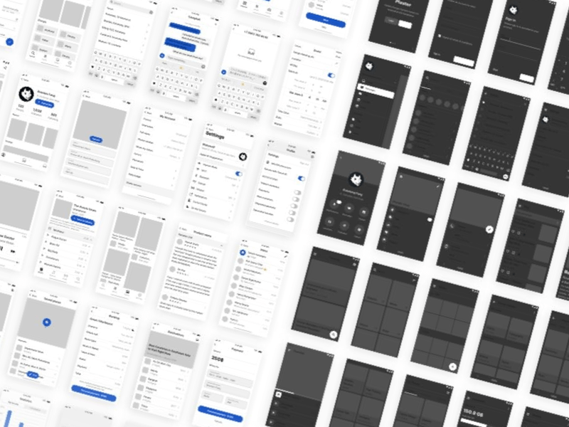
Using Sketch and the Auto Layout plugin I was able to create a responsive UX flow template. Using this method you can create extensive flows with 100% consistency. All you need to do is copy and paste a new screen or group of screens and everything else will rearrange itself to accommodate the new items while keeping all the same spacings between each-other. It will even adjust your background too! This saves so much wasted time trying to get everything evenly spaced while at the same time gives you a better looking result.

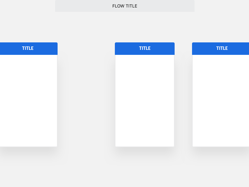
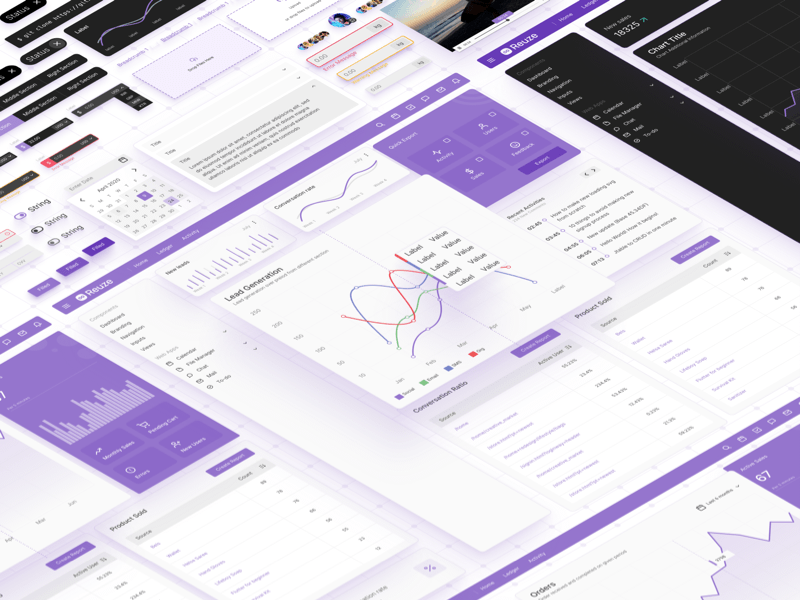
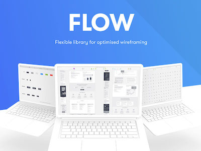

Using Sketch and the Auto Layout plugin I was able to create a responsive UX flow template. Using this method you can create extensive flows with 100% consistency. All you need to do is copy and paste a new screen or group of screens and everything else will rearrange itself to accommodate the new items while keeping all the same spacings between each-other. It will even adjust your background too! This saves so much wasted time trying to get everything evenly spaced while at the same time gives you a better looking result.