We're proud to present to you Hofmann - new and truly responsive UI kit designed by our friend, Elias Bikbulatov. Hofmann is created for responsive web pages and is based on classic Bootstrap breakpoints. This is a massive, extremely detailed, well-organized, and versatile UI kit. It contains 3 layouts: Large Desktop, Tablet and Phone. Features: Pixel-perfect baseline grid, 3 layouts, different variants, scalable vector icons, typography and styleguide, basic page templates. If you like this resource, please thank Elias by following him on Twitter and sharing this great freebie.


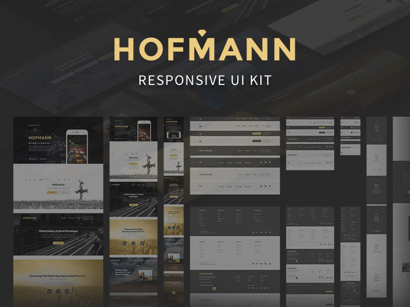
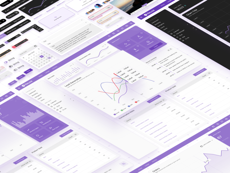


We're proud to present to you Hofmann - new and truly responsive UI kit designed by our friend, Elias Bikbulatov. Hofmann is created for responsive web pages and is based on classic Bootstrap breakpoints. This is a massive, extremely detailed, well-organized, and versatile UI kit. It contains 3 layouts: Large Desktop, Tablet and Phone. Features: Pixel-perfect baseline grid, 3 layouts, different variants, scalable vector icons, typography and styleguide, basic page templates. If you like this resource, please thank Elias by following him on Twitter and sharing this great freebie.