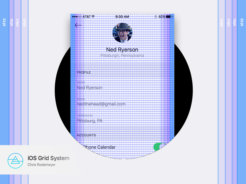
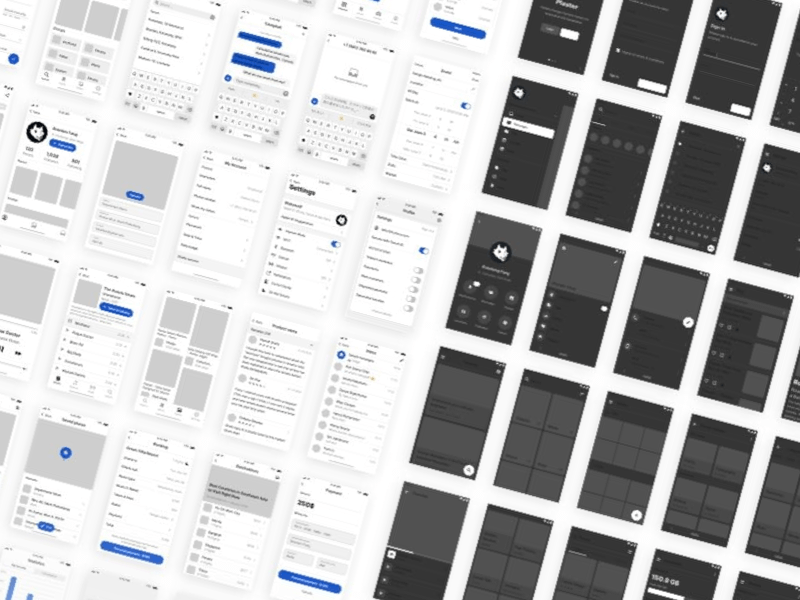
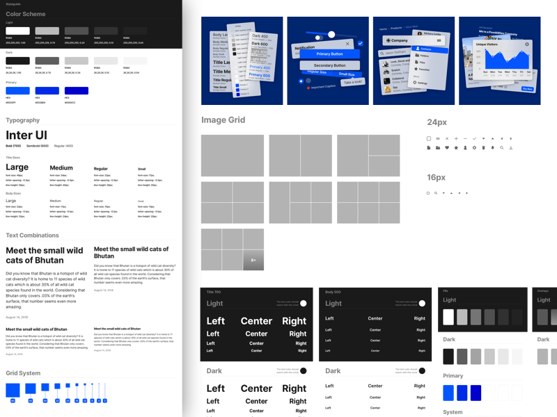
Inside this Sketch file is a template for iPhone 6 + iPhone 6 Plus, and an example mock-up of a generic profile UI to show you the grid rules in action.
The grid system based on 16x16pt grid increments, with a baseline of 8pt. The core text size is San Fransisco UI set at 32pt, which has an effective x-height of 16pt, lining up to our grid increment. From there, the type scale and UI elements are based on multiples of 4, ensuring that everything stays compliant to the vertical baseline rhythm (eg. 20pt caps headers, 24x24pt icons, 144x144pt avatar). We've also added some left and right margins rules that we've found to work well, but these can be adapted to the particulars of each project.
Note that it's OKAY to break the grid sometimes (say, if you need to break a 8pt unit to 4pt). In looking closely at Apple's own UIs, they aren't as strict to the grid and baseline as Android Material Design is, instead opting for more of a modular approach - though if you plop any iOS 9 screenshot on this grid you'll see most of the elements line up. The point of any grid system, including this one, is to provide a consistent relational foundation that informs your design, but it's just a tool. Don't drive yourself crazy getting every single thing to line up just right, just have rationale for when you need to deviate and be systematic and consistent - something you see a lot in Apple's approach.
Made with the Free Association Team